BLS was established in 1884, and some of our programs date back nearly that far. We have more than a century of statistics on prices, employment, wages, productivity, and more. But even in those early days, we realized that pages full of numbers can be a little dull. We frequently use pictures to tell the stories behind those numbers and help readers see the important points more quickly. Let’s look at over a century of BLS price statistics, in five charts.
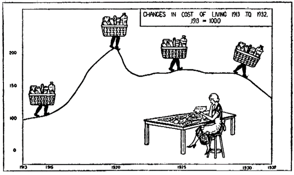
The first chart, which looks hand drawn, was originally presented as part of the Department of Labor’s exhibit at the Century of Progress International Exposition in Chicago in 1933, also known as the Chicago World’s Fair.

The chart below depicts changes in the cost of living from 1913 to 1932, based on the BLS Consumer Price Index. Here we see market baskets (with legs) rising during World War I, then declining and holding steady during the roaring 1920s, and declining as the nation entered the Great Depression.
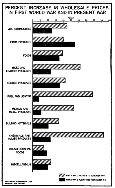
The next chart, again looking hand drawn – this time perhaps with a ruler – compares wholesale prices (what we now call the Producer Price Index) in the years leading up to the United States entering World War I and World War II. It comes from the first of two BLS bulletins on Wartime Prices. The increase in the wholesale price for all commodities was nearly twice as great in the earlier period, reflecting large differences in the price change for such commodities as fuel and chemicals.
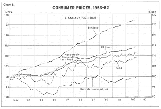
Now, let’s move forward about 20 years. BLS published a chart book in 1963 focusing on price changes over the prior decade. The chart book presented both consumer and wholesale prices for the nation, along with consumer price trends in the 12 largest U.S. cities. The chart shown here, perhaps produced on an early computer, tracks the change in prices for all consumer items, and separately for various categories. Prices for durable commodities, such as appliances and furniture, declined in the early part of the period and later rebounded, resulting in virtually no price change over the decade. In contrast, the price of services, such as shelter, transportation, and medical care, rose steadily throughout the period.
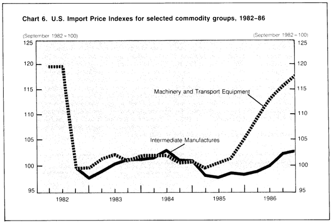
With advances in computer software, BLS expanded the use of charts to allow readers to visualize data trends. Such charts became prominent in the BLS flagship publication, the Monthly Labor Review. In an article from 1987, data from the BLS International Price Program track price changes for selected imports.
BLS ushered in the age of interactive charts in recent years, making chart packages available with most news releases. In the chart below, readers can track a decade of consumer price changes for all items, and then click on selected categories to compare trends. Want to compare price changes for food at home with food away from home? It’s just a couple of clicks away.
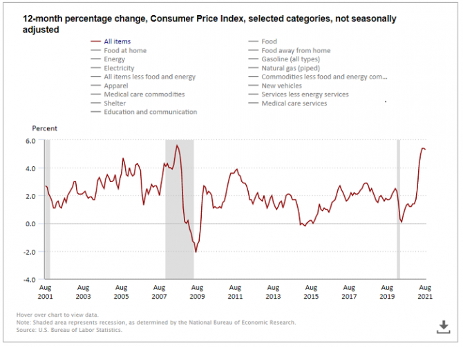
Source: Charts related to the Consumer Price Index news release.
Our charts today are a lot more sophisticated than the hand-drawn charts of the early twentieth century. They may not have amusing cartoon characters like the CPI market basket with legs, but they have interactive features that let you dig into more details about the data or choose the data you want to see. We also have several publications that focus on the visual display of data. Check out The Economics Daily and Spotlight on Statistics!
 United States Department of Labor