
An official website of the United States government
An official website of the United States government
The .gov means it's official.
Federal government websites often end in .gov or .mil. Before sharing sensitive information,
make sure you're on a federal government site.
The site is secure.
The
https:// ensures that you are connecting to the official website and that any
information you provide is encrypted and transmitted securely.
The Bureau of Labor Statistics’ (BLS) Consumer Price Index (CPI) measures the changes in prices people pay for goods and services. BLS publishes indexes to show these changes. BLS sets the average index level (representing the average price level)—for example, for the 36-month period covering the years 1982, 1983, and 1984 (i.e. the base period)—equal to 100. BLS then measures changes in relation to that figure. An index of 110, for example, means there has been a 10-percent increase in price since the base period; similarly, an index of 90 means a 10-percent decrease.
Movements of the index from one date to another can be expressed as changes in index points (simply, the difference between index levels), but it is more useful to express the movements as percent changes. This is because changes in index points tell us how prices changed relative to the reference period, but percent changes allow us to express the change in prices between any two periods of time. For example, a change in an index of 180 to 190 is a 10-point change just like the above example, but is not a 10-percent increase like above. Rather, it is a 5.6-percent increase (190 − 180 = 10. 10 ÷ 180 = 0.05555). This is why expressing change in percent form is a better gauge of relative change. In this activity, you will graph 12-month percent changes to show the movement in prices over previous years.
At the conclusion of this activity, you will be able to identify where to locate CPI data, improve your graphing skills, properly label a graph, and describe the percent change in prices for various items. Additionally, you will better understand how inflation occurs and how it is measured.
This activity uses real-world data to reinforce graphing fundamentals. Using graph paper, graph three or more percent changes on the same plot. You may choose to graph similar items (examples: Men’s Apparel, Women’s Apparel, and Footwear) or unrelated items (examples: carbonated drinks, computer software and accessories, and admission to movies, theatres, and concerts) that you are interested in. Be sure to properly label and title the graph, provide a scale, and be able to describe the meaning of the graph. You can download data tables into Microsoft Excel using the icon above each database generated table.
Label the elements of a graph: title, time period, as well as labels and scales on both axes. The graph should have a caption at the bottom, showing the source of the data (in this instance, “Source: Bureau of Labor Statistics, CPI-U”). You will graph the 12-month percent changes (using December as the reference month) of goods over time and discuss reasons prices may change over time.
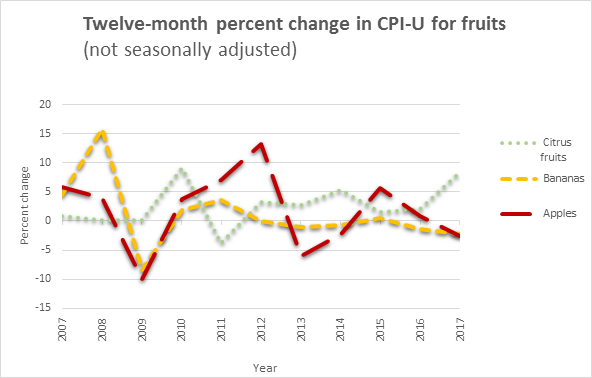
NOTE: CPI-U is the index for All Urban Consumers.
SOURCE: U.S. Bureau of Labor Statistics, CPI-U.
For more information about the CPI, students should read the Consumer Price Index overview available at https://www.bls.gov/cpi/overview.htm and the Consumer Price Index Frequently Asked Questions (FAQs) available at https://www.bls.gov/cpi/questions-and-answers.htm.
Last Modified Date: January 10, 2019
