Last year I wrote about how we’ve been using more charts and maps to explain our data. In another post I wrote about how BLS deals with uncertainty in our measures and how we explain the strengths and limitations of our data. Today I want to tell you about a new chart that will help you see measures of uncertainty in one of our most closely watched series—nonfarm employment.
We recently fielded a survey to ask data users about our ideas for creating charts that show confidence intervals. A confidence interval is a measure of the uncertainty in our estimates. We asked data users to tell us if confidence intervals would give them useful information. If so, how can we present confidence intervals in a clear, visually appealing way? Based on your responses, we will add a chart showing confidence intervals to the package of interactive graphics we update each month with The Employment Situation report. We will post the new chart when we release the November 2016 national employment numbers on Friday, December 2.
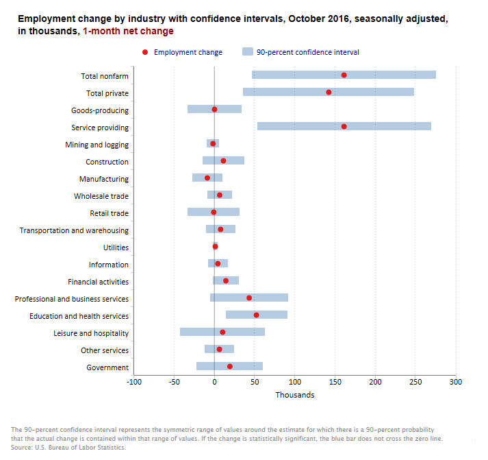
The responses to our survey confirm you want to know more about the limitations of the employment data. The red dots in the chart show the over-the-month employment changes for total nonfarm and the major industries. The blue bars show the 90-percent confidence intervals of the employment changes for each of these groups.

What does this chart tell us? The red dot for total nonfarm employment shows a gain of 161,000 jobs in October, as we reported on November 4. That number is an estimate based on our monthly sample survey, rather than a complete count of jobs each month. Different samples of employers might give us different estimates of employment change. We can measure the sampling error, the variation that occurs by chance because we collected the number from a sample of employers instead of all employers. With our measure of sampling error, we can calculate a confidence interval. The blue bar for total nonfarm shows the 90-percent confidence interval ranged from 46,800 to 275,000. We call this a 90-percent confidence interval because, if we were to choose 100 different samples of employers, the October nonfarm employment change would be between 46,800 and 275,000 in 90 of those samples.
We also learn from this chart whether an employment change is statistically significant. A change is statistically significant if the blue bar in the chart does not cross the zero line. For example, the confidence interval for construction includes zero, so we can’t say with confidence that construction employment increased in October. For education and health services, however, the confidence interval does not include zero, so we can say more confidently that employment in the industry rose over the month.
The chart here shows the 1-month employment changes. When we begin publishing it on December 2, we will also let you choose charts that show 3-, 6-, and 12-month changes.
Check out the new charts and let us know what you think in the comments below. We’re always looking for better, clearer ways to explain our data, and I welcome you to share your ideas.
 United States Department of Labor