Last spring I wrote about how we’ve been using more and better charts and maps to help you understand our statistics. Today I’m excited to tell you about a new set of graphical tools to make our news releases more illuminating at the moment of their posting.
We want everyone to be able to “see” quickly what’s in the hundreds of news releases we publish every year—on price trends, pay and benefits, productivity, employment and unemployment, job openings and labor turnover, and other topics. The format of these news releases still typically includes a few pages of text to explain the latest information about a topic. Most releases also include tables with lots and lots of numbers. These news releases have served our customers well for decades, but we’re always looking for ways to improve our products and services. Many of you have told us that adding charts and maps to our news releases would make them more useful and easier to understand. In recent years we’ve added charts and maps to many news releases, but most releases only include a couple of these visualizations. We are committed to do more.
We’re adding a cool new feature to many of our releases. Starting last fall, we began posting sets of interactive graphics to complement some of our most widely read economic reports. We’ll update these graphics with each new release of data. Our monthly news release on import and export price indexes was the first to have a set of interactive graphics. The quarterly Employment Cost Index news release was the next to include interactive graphics. Most recently, when we published the Employment Situation—often our most watched news release—on January 8, we presented a lengthy new set of charts from our monthly surveys of households and nonfarm establishments. Over the coming months, we will add chart sets for more releases.
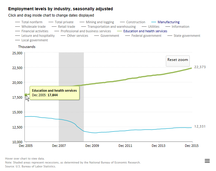
I’ve used the word “interactive” to describe these charts. Let me explain what that means. Interactive features let you choose what you want to see. For example, our chart showing nonfarm employment levels over the last 20 years starts out with two lines, one for total nonfarm employment and the other for total private employment. The legend above the chart lets you turn categories on or off, simply by clicking on the industry titles in the legend. If you want to look at, say, the last 10 years instead of the last 20, you can change the time period by clicking and dragging within the chart. If you hover your pointer over the lines in the chart, you can see the exact values for individual months.

In the coming months we will continue to develop interactive graphics for the rest of our most watched monthly and quarterly news releases. Our goal over the next few years is to have interactive graphics to accompany all or nearly all of our news releases. I am thrilled to have this great set of tools to serve our customers better.
Take a look. I know you’ll agree with me that the BLS staff have done a fine job crafting these ready-to-go visualizations. Whatever BLS statistics you follow, I hope you find many uses for them and send us a lot of comments and suggestions!
 United States Department of Labor